CSS Grid
I don’t know why I never deep dived into learning CSS Grid before but here I am! I really could’ve made my life easier by spending just an hour learning this.
Grid Template
First thing we gotta do is figure out how to create a grid. We do this by defining the number of rows and columns we want using grid-template-rows and grid-template-columns.
.container {
	display: grid;

	// 2 rows and 2 columns
	grid-template-rows: 200px 200px;
	grid-template-columns: 200px 200px;
}
Grid Units
Columns and rows can be defined by any valid CSS unit, including pixel, rems, viewport units, percentages and so on.
These units are pretty rigid so if we want our grid cells to be a bit more flexible we can use fr instead. fr stands for “fraction” and it has a more flexbox style of flexibility to it where it will grow and shrink as required by its contents.
Example:
.container {
	display: grid;
	grid-template-columns: repeat(2, 1fr) 2fr;
	grid-template-rows: repeat(3, 100px);
	grid-gap: 1rem;
}
Position grid cells
Grid cells are each “box” inside your grid container. They are numbered from left to right and top to bottom. As shown:
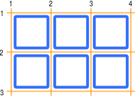
The yellow lines indicate the grid lines. These are the lines in between the grid cells that indicate where grid cells start and end.
Using these grid lines, we can position cells where we want and expand them to where we want.
Example:
.item-1 {
  grid-row-start: 2;
  grid-row-end: 3;
  grid-column-start: 2;
  grid-column-end: 3;

  // shorthand
  grid-row: 2 / 3;
  grid-column: 2 / 3;
}
Alternative Unit: Named Lines
Instead of using numbers to indicate grid lines, we can instead assign custom names for our own reference.
To name a grid line, we provide the name in square brakets, for example, [main-start sidebar-start].
To define one column or row, we must provide 2 values, the start and the end. And we can use any mix of units we’d like. Like so:
.container {
  display: grid;
  grid-template-columns:
    [main-start sidebar-start] 200px
    [sidebar-end content-start] 1fr
    [column3-start] 1fr
    [content-end main-end];
  grid-template-rows:
    [row1-start] 80px
    [row2-start] 1fr
    [row3-start] 1fr
    [row4-start] 100px
    [row4-end];
}
Then we can position our grid cells however we’d like using our named lines as a reference.
.header {
  grid-column: main-start / main-end;
  grid-row: row1-start / row2-start;
}

.sidebar {
  grid-column: sidebar-start / sidebar-end;
  grid-row: row2-start / row4-start;
}

.content-1 {
  grid-column: content-start / content-end;
  grid-row: row2-start / row3-start;
}

.content-2 {
  grid-column: content-start / column3-start;
  grid-row: row3-start / row4-start;
}

.content-3 {
  grid-column: column3-start / content-end;
  grid-row: row3-start / row4-start;
}

.footer {
  grid-column: main-start / main-end;
  grid-row: row4-start / row4-end;
}
Example
Practice
Honestly a lot of this stuff is hard to wrap your mind around without and hands-on practice so here a few websites you can use to practice and learn:
Other Resources
Note: All examples were taken from Firefox Introduction to CS Grid Layout